
PyTASER Materials Project Workflow#
The following examples use data from the Materials Project database to generate the predicted transient absorption spectra under various conditions. This takes advantage of pre-computed electronic structure from density functional theory (DFT).
Note: This notebook will require an API key that can be acquired from here. This key can then be added to your .pmgrc.yaml file as below to prevent the need to repeatedly enter it:
pmg config --add PMG_MAPI_KEY <YOUR_API_KEY>
Setup#
# Install package (if not done already)
!pip install git+https://github.com/WMD-group/PyTASER --quiet
%matplotlib inline
from pytaser.generator import TASGenerator
GaAs#
Materials Project Bandstructure#
from pymatgen.ext.matproj import MPRester
from pymatgen.electronic_structure.plotter import BSPlotter

mpr = MPRester()
bs = mpr.get_bandstructure_by_material_id("mp-2534")
plt = BSPlotter(bs).get_plot(vbm_cbm_marker=True, ylim=[-3, +3])
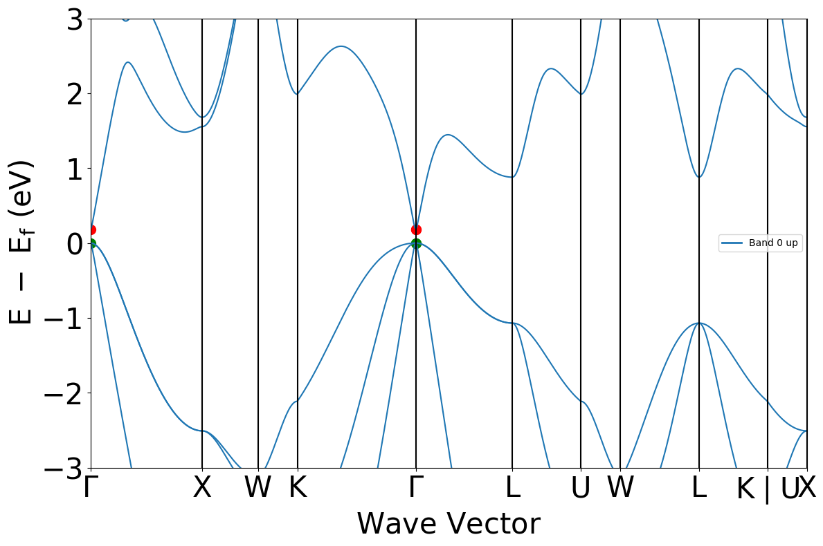
bs.get_band_gap()
{'direct': True, 'energy': 0.1839000000000004, 'transition': '\\Gamma-\\Gamma'}
As shown from the above bandstructure, the MP database often underestimates material bandgaps. The experimental direct bandgap for GaAs is actually observed to be 1.5 eV.
This arises due to the use of semi-local exchange correlation (GGA) functionals in their calculations - to correct for this, we must apply a scissors operator and increase the bandgap to that of the inputted experimental bandgap.
Setting up the TASGenerator object#
generator_2534 = TASGenerator.from_mpid("mp-2534", bg=1.5)
The from_mpid method generates a TASGenerator object using the bandstructure and DOS objects imported from the MP database. As we have defined the bg argument as the experimental bandgap, the bandstructure and DOS objects are scissored accordingly, as can be seen in the below cell.
Additionally, this method generates kpoint-weightings for the inputted material, as long as it uses a uniform-mode kgrid for its bandstructure.
Warning
For a small subset of materials on the Materials Project, the bandstructure/DOS calculations used a custom code to generate the symmetry adapted k-point mesh, which was broken and omitted random k-points. PyTASER requires a uniform k-point mesh (symmetry reduced is fine) to calculate the k-point weights, and so these materials will yield an error with TASGenerator.from_mpid() of the form: ValueError: Expected X points but found Y.
If you encounter this error, you can try using a different Materials Project task_id if possible, or run PyTaser from your own DFT data.
generator_2534.bs.get_band_gap()
{'direct': True,
 'energy': 1.5,
 'transition': '(0.000,0.000,0.000)-(0.000,0.000,0.000)'}
Generating the TAS profiles#
tas_2534 = generator_2534.generate_tas(
    temp=298,
    conc=1e18,  # inversely proportional to time delay
    energy_min=0.5,
    energy_max=5,
)
# generating the occupancies of each band using the Fermi-Dirac distribution as implemented in pymatgen.
# externally determined occupancies can also be inputted if desired
The spectra can take a while to generate, depending on the number of bands and kpoints we are considering in the system. To save time during (re-)analysis for particularly complex systems, we can save our generated TAS object to a json file.
from monty.serialization import dumpfn

dumpfn(tas_2534, "GaAs/tas_2534.json")
When we want to redo some of this analysis, in this notebook or a new one, we can load the TAS object from the json file, without having to re-generate the data.
from monty.serialization import loadfn

tas_2534 = loadfn("GaAs/tas_2534.json")
Plotting#
Let’s plot the predicted TAS spectrum for this material, under the conditions we specified above:
from pytaser.plotter import TASPlotter

plot_2534 = TASPlotter(tas_2534, material_name="GaAs")
wavelength_plot = plot_2534.get_plot()
Ok let’s customise the plot a bit:
energy_plot = plot_2534.get_plot(xaxis="energy", xmin=0.5, xmax=4, yaxis="jdos_diff")
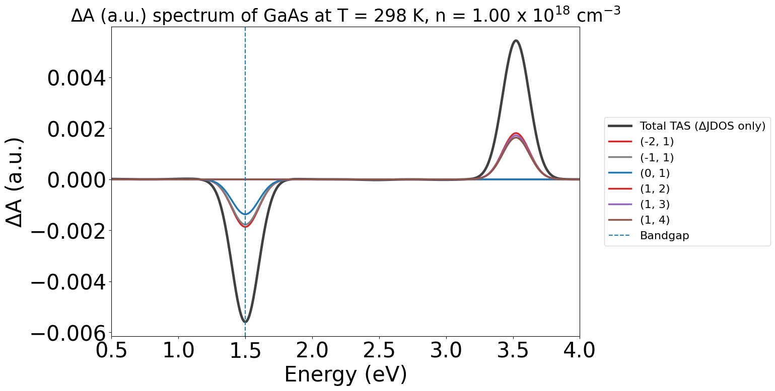
Note
Note:
In these plots, the labels (-2,-1) etc. refer to the band indices for the corresponding optical transition. The first being the initial band and the second being the final band in the electronic transition.
Negative band indices refer to bands in the valence band (VBM as Band #0), and positive indices refer to bands in the conduction band (CBM as Band #1).
Without the WAVEDER files used in the PyTASER DFT Example, the TAS spectra we calculate does not consider oscillator strengths - it is just the change in joint density of states. Thus, the yaxis argument is set to jdos_diff.
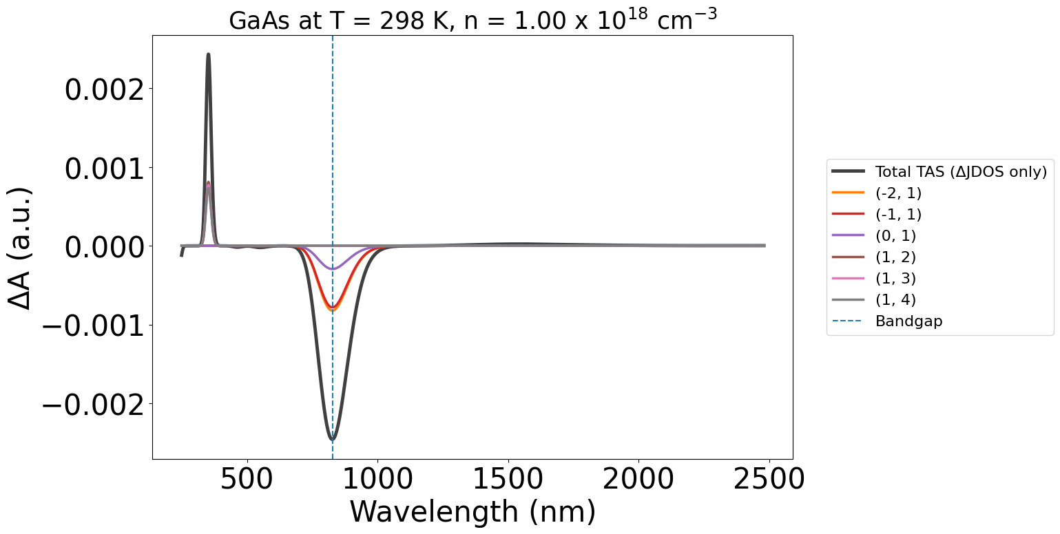
We can also plot the spectra as a function of wavelength, by setting xaxis="wavelength" (and adjusting the xmin and xmax respectively)
energy_plot = plot_2534.get_plot(
    xaxis="wavelength",
    xmin=400,
    xmax=1400,
    yaxis="jdos_diff",
)
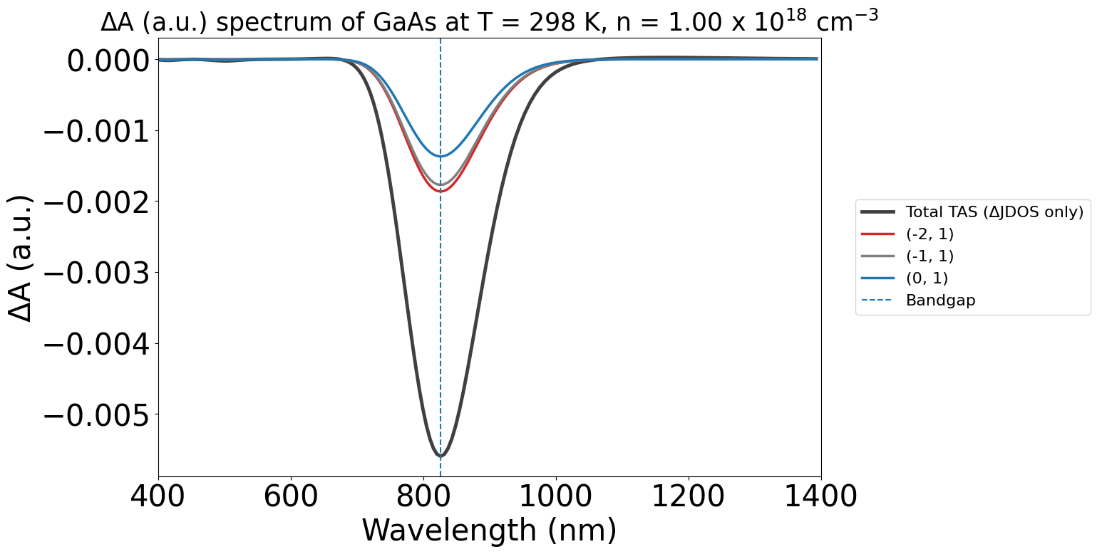
Joint Density of States (JDOS)#
Another plotting option is to plot the individual JDOS spectra - to show the JDOS in the dark and under illumination separately. This will show the optically linked electronic states in their respective light conditions.
energy_plot = plot_2534.get_plot(xaxis="energy", xmin=0.5, xmax=4, yaxis="jdos", invert_axis=True)
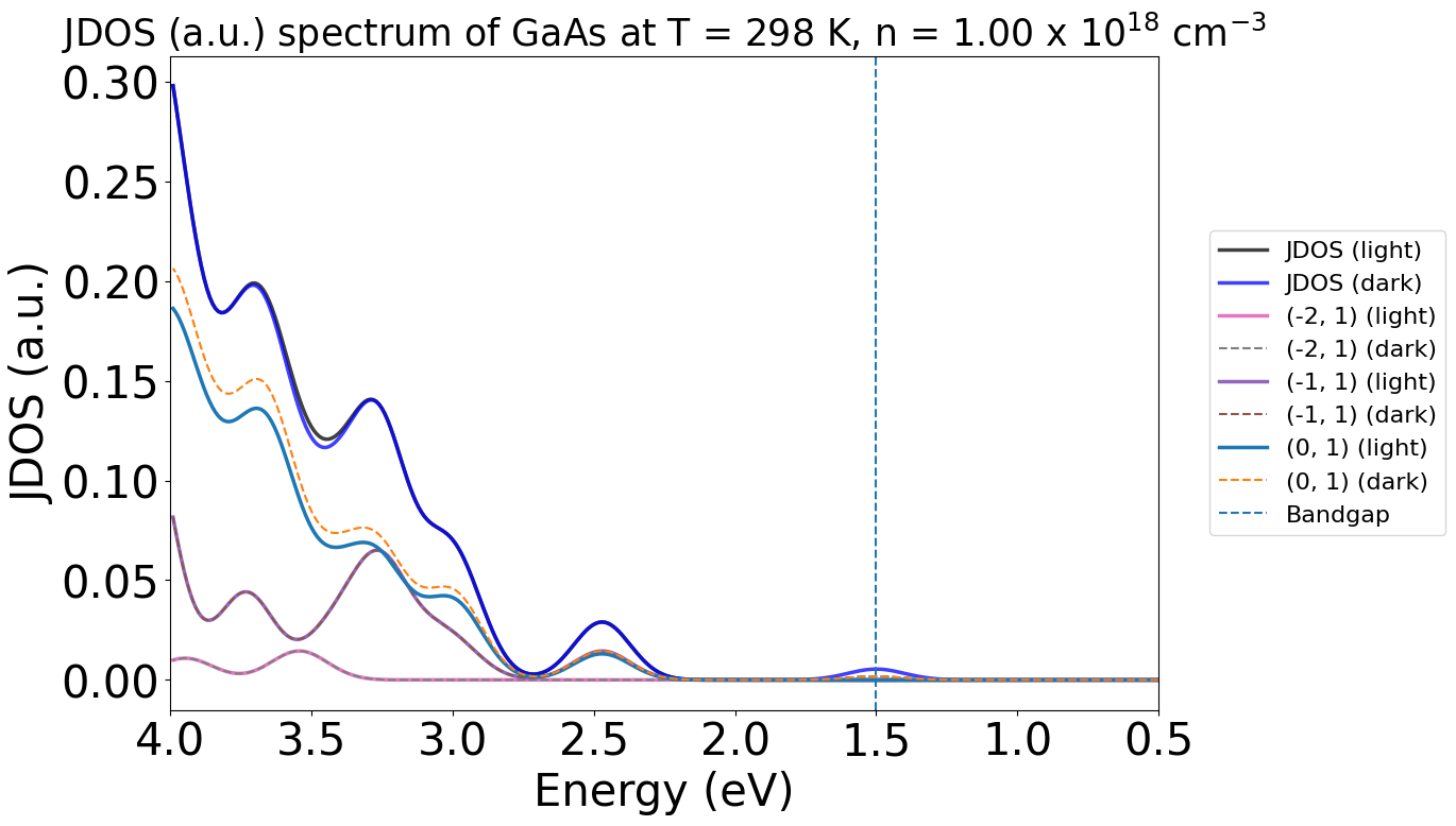
Here, we see notable differences between the dark (blue) and light (black) plots at ~3.5 eV and ~1.5 eV, matching with the peaks we see in the earlier energy TAS plot.
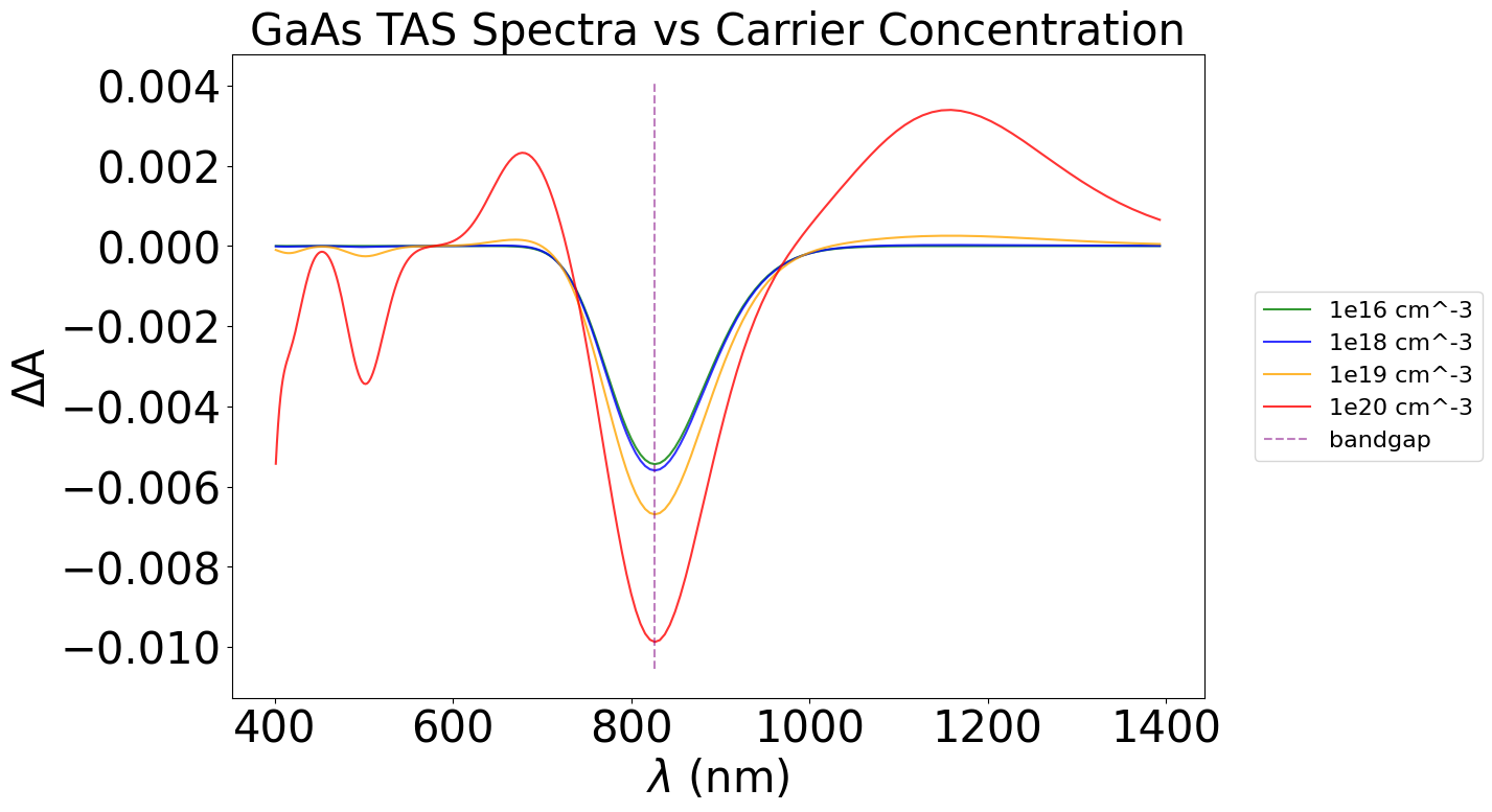
Changing conditions#
A significant advantage of predictive spectra is the ability to vary the system conditions. In PyTASER, the two main conditions we can change are the temperature of the system and the pump-probe time delay, which will both influence the occupancies of the bands based on the Fermi-Dirac approximation.
This is achieved by altering the conc and temp tags in the generate_tas method. We use the conc as an analogy of the pump-probe time delay, as the carrier concentration is inversely proportional to the time delay between initial excitation and absorption measurement.
Note: At the moment, conc can only be qualitatively compared to the time delay - to make a quantitative comparison, we need to consider carrier recombination rates, which would differ with each system. Thus, this functionality should be used more to understand the origin of different spectral features, rather than to provide a full, quantitative comparison.
import matplotlib.pyplot as plt
from monty.serialization import loadfn


conc_xydata = loadfn("GaAs/conc_xydata.json")

colors = ["green", "blue", "orange", "red", "purple"]
labels = ["1e16", "1e18", "1e19", "1e20", "bandgap"]
plt.figure(figsize=(12, 8))

for i, data in enumerate(conc_xydata):
    x = data[:, 0]
    y = data[:, 1]

    if labels[i] == "bandgap":
        # Plot the "bandgap" line as dashed
        plt.plot(x, y, color=colors[i], linestyle="--", label=labels[i], alpha=0.5)
    else:
        plt.plot(x, y, color=colors[i], label=f"{labels[i]} cm^-3", alpha=0.8)

plt.xlabel(r"$\lambda$ (nm)", fontsize=30)
plt.ylabel("ΔA", fontsize=30)
plt.title("GaAs TAS Spectra vs Carrier Concentration", fontsize=30)
plt.grid(False)
plt.xticks(fontsize=30)
plt.yticks(fontsize=30)
plt.legend(loc=("center left"), bbox_to_anchor=(1.04, 0.5), fontsize=(16))
plt.show()
Similarly, this can be done with varying temperatures.
Note: Due to limitations of the pymatgen FD approximation method used during the band occupancy generation stage, PyTASER cannot calculate system occupancies at 0 K. It may also struggle with other lower temperatures, but this is dependent on the bandgap of the sytem - usually anything above 25 K is fine.
from monty.serialization import loadfn

temp_xydata = loadfn("GaAs/temp_xydata.json")

colors = ["red", "orange", "blue", "green", "purple"]
labels = ["50 K", "150 K", "300 K", "450 K", "bandgap"]
plt.figure(figsize=(12, 8))

for i, data in enumerate(temp_xydata):
    x = data[:, 0]
    y = data[:, 1]

    if labels[i] == "bandgap":
        # Plot the "bandgap" line as dashed
        plt.plot(x, y, color=colors[i], linestyle="--", label=labels[i], alpha=0.5)
    else:
        plt.plot(x, y, color=colors[i], label=labels[i], alpha=0.8)

plt.xlabel(r"$\lambda$ (nm)", fontsize=30)
plt.ylabel("ΔA", fontsize=30)
plt.title("GaAs TAS Spectra vs (Carrier) Temperature", fontsize=30)
plt.grid(False)
plt.xticks(fontsize=30)
plt.yticks(fontsize=30)
plt.legend(loc=("center left"), bbox_to_anchor=(1.04, 0.5), fontsize=(16))
plt.show()
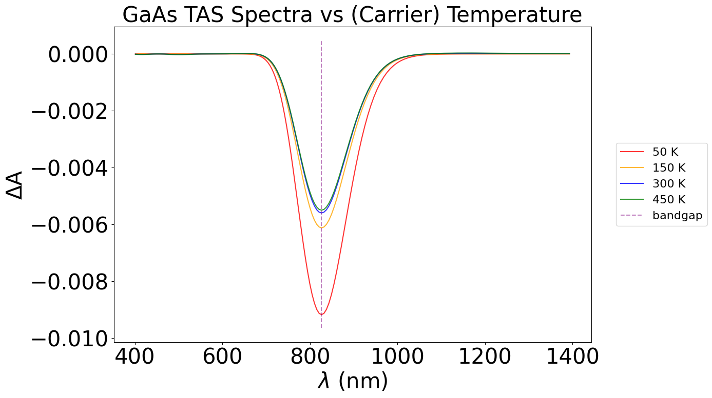
With the above plot, we can observe a higher dip in the ΔA plot as we decrease temperature, in the bandgap region. At higher temperatures, electrons are thermally excited from the VBM, causing a lower change in absorption between the dark (just thermal excitation) and the light (thermal + photo excitation) - thus, a smaller overall change in the TAS spectrum at the bandgap. However, since a small number of carriers are already in their excited state at higher temperatures, we also see changes in regions away from the bandgap. This is hard to see in this system, but we can see small fluctutations between temperatures around the 500 nm and 1100 nm marks.
Individual band transitions#
We can visualise individual the contribution of individual band transition to the overall spectrum, whether JDOS or TAS. These individual transition contributions can be very useful to highlight specific spectral features in the overall spectra. This can be a big time-saver for quick analysis, as the numerically accurate method uses a series of complicated Fourier transforms to isolate these contributions.
Note: The likelihood of each band transition happening is linked to the transition probability (and thus the oscillator strength, as used in the DFT example). This is not possible to include here, due to limitations in the MP database, so the overall spectrum may differ qualitatively to experimental spectra, especially those with long recombination times!
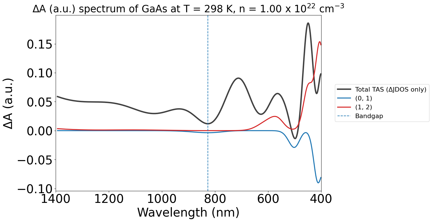
conc_22 = loadfn("GaAs/gaas_conc_22.json")
plot_22 = TASPlotter(conc_22, material_name="GaAs")
energy_plot_22 = plot_22.get_plot(
    xaxis="wavelength", transition_cutoff=0.01, xmin=400, xmax=1400, yaxis="jdos_diff", invert_axis=True
)
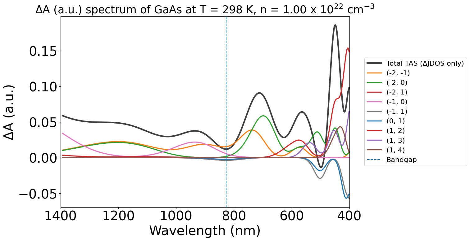
Additionally, we can adjust the contribution threshold transition cutoff of the plots to get rid of less important transitions. The maximum of this is 1.0, which will show the largest contributing transition only.
energy_plot_22 = plot_22.get_plot(
    xaxis="wavelength", transition_cutoff=0.5, xmin=400, xmax=1400, yaxis="jdos_diff", invert_axis=True
)
Plot Customisability#
Being a pyplot object, we can edit the plot’s size, colour, title, etc. after generating it, using standard integrated matplotlib features.
As such, this section includes a few of the customisations that might be more relevant for comparisons with experiment and to make the plots more publication-ready. As the code develops, we hope to add more functionality to make it more interactive and visually appealing.
X-axis inversion#
Varying experimental literature can present different axes directions in the x-axis, especially when comparing between wavelengths and electronvolts. To allow for a more fluid comparison between the outputs from PyTASER and literature, we can use the inverse_axis Boolean variable when plotting the spectrum to flip the x-axis direction.
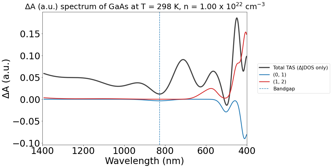
The non-inverted version:
energy_plot_22 = plot_22.get_plot(
    xaxis="wavelength",
    transition_cutoff=0.5,
    xmin=400,
    xmax=1400,
    yaxis="jdos_diff",
    # invert_axis=True
)
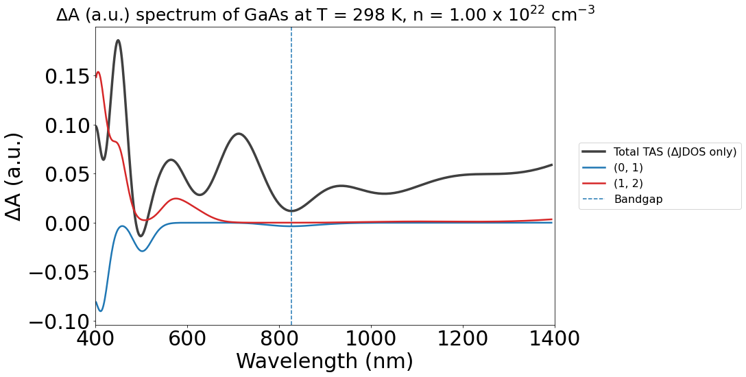
The inverted version:
energy_plot_22 = plot_22.get_plot(
    xaxis="wavelength", transition_cutoff=0.5, xmin=400, xmax=1400, yaxis="jdos_diff", invert_axis=True
)
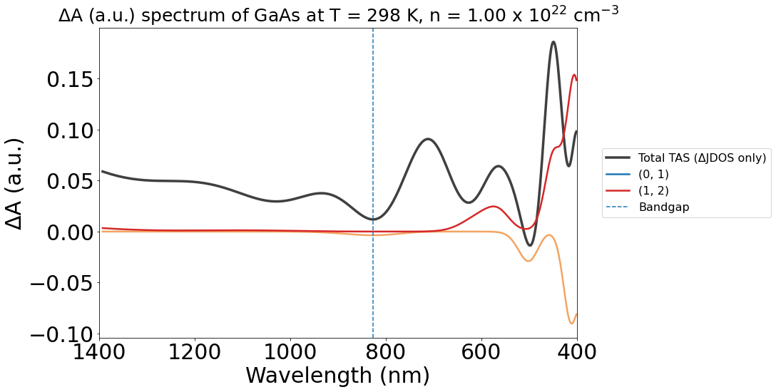
Changing color themes#
Although PyTASER’s functionality ensures that the colors are consistent for band-transitions between different plots, it is also relatively easy to change the colours of the lines as you want.
An example is shown below, with a simple code written to change the color of the (0, 1) band transition from blue to sandybrown. A loop can also be used if this is required for multiple lines.
import matplotlib.pyplot as plt


# Generate the plot as before
energy_plot_22 = plot_22.get_plot(
    xaxis="wavelength", transition_cutoff=0.5, xmin=400, xmax=1400, yaxis="jdos_diff", invert_axis=True
)

# Suppose you want to change the color of the line labeled "(0, 1)"
target_label = "(0, 1)"  # This must be a string, and must match the label shown in the legend.
new_color = (
    "sandybrown"  # New color you want to assign to the line - can be anything recognised by matplotlib
)

# Get the lines in the current Axes
lines = energy_plot_22.gca().get_lines()

# Iterate over the lines and find the one with the target label
for line in lines:
    if line.get_label() == target_label:
        # Change the color of the line
        line.set_color(new_color)
        break  # Exit the loop once the line is found

# Show or save the plot
plt.show()
Saving the plot#
To save the plot, we can use the savefig() method on the generated plot. As the legend is placed outside of the plot, it can be saved separately using the get_legend() method on the gca() object and then included like shown below.
# Generate the plot, as before
energy_plot_22 = plot_22.get_plot(
    xaxis="wavelength", transition_cutoff=0.5, xmin=400, xmax=1400, yaxis="jdos_diff", invert_axis=True
)

# Set the legend as a variable
lgd = energy_plot_22.gca().get_legend()

# Save the figure
energy_plot_22.savefig(
    fname="GaAs/GaAs_savedfig.png", bbox_extra_artists=(lgd,), bbox_inches="tight", transparent=True
)
# fname sets the output location and name where the generated plot will be saved.
The saved plot can be seen in the GaAs example folder, as a png file.
Many types of output are supported, including raster formats like PNG, GIF, JPEG, TIFF and vector formats like PDF, EPS, and SVG.